Clear-space
Reserve at least the height of the “C” on all sides. Nothing, text, imagery, container edges, should encroach on this margin.
Everything you need to apply the Credible brand consistently , logo, color palette, typography, iconography, spacing, radii, shadows, buttons, and voice. Built from the live design tokens that drive this site.
A single horizontal wordmark. Always reproduce with adequate clear-space and at a legible size. Use the ink-on-light variant by default; the inverse appears automatically on dark surfaces through CSS theming.
Reserve at least the height of the “C” on all sides. Nothing, text, imagery, container edges, should encroach on this margin.
Don’t reproduce the wordmark below 20 px tall on screen, or 14 mm tall in print. Use the standalone mark for smaller contexts.
Don’t rotate, recolor, outline, stretch, drop-shadow, or add effects. Don’t place on busy photographic backgrounds without a solid backdrop.
Forest-green primary, cool-mint surfaces, deep-ink type. The brand green (#1d895a) carries primary actions; the brighter mint (#4CBB84) carries highlights, gradients, and hover energy.
Inter drives the entire interface. UI labels, body, headings. Instrument Serif appears only as italic emphasis inside display headings, never as standalone type. System mono for code and tabular data.
24×24 viewBox, 1.5 px stroke, rounded line caps and joins, no fill. Icons inherit currentColor so they tint automatically with text and theme.
All gaps, padding, and margins are multiples of 4 px. Stay on the scale, even when it looks tight or generous, the rhythm matters more than any single value.
Five radii cover almost everything: 6 / 10 / 18 / 24 / pill. Smaller for utility, larger for hero cards, pills for actions.
Shadows are tinted green to keep them in-brand. The most prominent, Glow, is reserved for hover and focus states on primary actions.
0 1px 0 rgba(0,0,0,0.03)0 8px 24px -16px rgba(29,137,90,0.10)0 18px 50px -22px rgba(29,137,90,0.20)0 12px 28px -10px rgba(29,137,90,0.55)Three variants, Primary, Secondary, Ghost, at two sizes (default + lg). Primary buttons are black at rest and flip to brand green on hover.
Direct, modern, technically credible. We use plain English first, jargon second, and only when the jargon is the truest word. We trust the reader to be smart and busy.
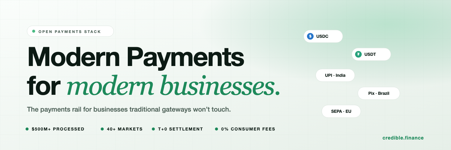
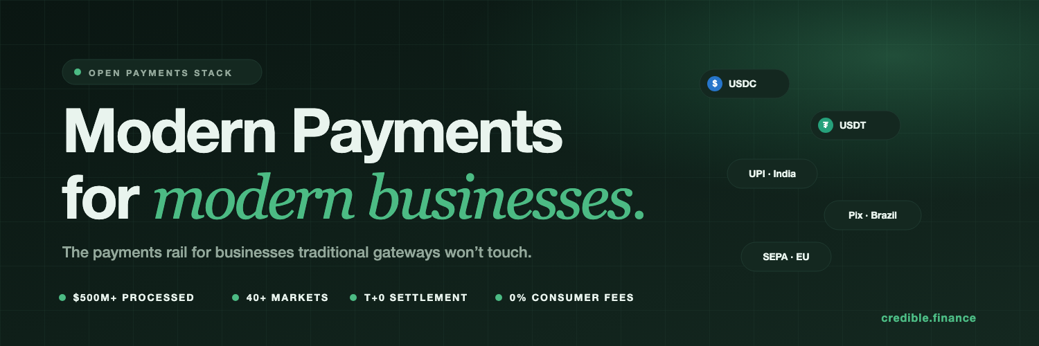
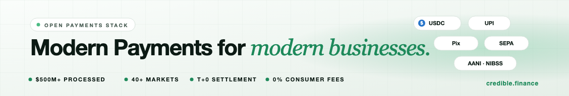
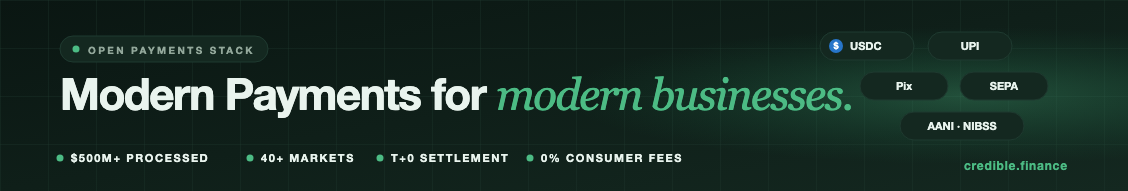
Pre-rendered profile covers for X / Twitter (1500 × 500) and LinkedIn company pages (1128 × 191), in both light and dark variants. Download the PNG for direct upload, or grab the SVG for editing.
Logo set (SVG, PNG, monochrome variants), favicons, partner assets, press-kit, and presentation templates.